
Friday, January 30, 2009
Saturday, January 24, 2009
Sick. Tired. Bored.
So, not one of my better days. Sigh.
Still, one must eat, if only to keep one's spirits afloat and the body nourished. No pictures tonight, though; it just seemed like too much work.
I started by trimming a pork tenderloin of all silverskin and excess fat, then seasoned it liberally with kosher salt, ground cumin, ground cinnamon, and mignonette pepper (a blend of black and white pepper plus coriander seed). Into a little oil in a hot sauté pan for about 1-2 minutes on each side, then into a preheated 375° oven for about 10 minutes, until an instant-read thermometer showed 130° (inserted in the thickest section). Out it came to rest on the stove top (the temperature rose to about 142°).
Meanwhile, in a second skillet, I started caramelizing half a sweet onion, chopped, in a little butter, along with a small winter squash, seeded, peeled and cut into about 3/4 inch cubes. I seasoned all that with kosher salt, freshly ground black pepper, ground cinnamon, and about 1/8 teaspoon of ground dried chipotle pepper. I covered the pan for about 5 minutes, then continued cooking it with the lid off until everything was nicely caramelized.
I took four small flour tortillas and arranged them on a rimmed baking dish, then scattered some squash/onion medley over each. I sliced the pork into 1/4 inch slices and arranged four slices on each tortilla. I spooned a little mango-peach salsa on, then a little shredded cheese (a mix of medium cheddar and monterey jack--not too much). I popped the baking sheet into the oven, still at 375°, for about 7 minutes, until the cheese was melted and bubbling.
Served them topped with left-over guacamole, made with lots of lime juice and cilantro, and shredded lettuce. We ate them with a knife and fork, but you could pick them up if you're adventurous.
Pretty tasty. A nice melange of flavors and textures. All that's left is the dishes. Sigh.
Monday, January 19, 2009

Sunday, January 18, 2009
Cooking: Thai Red Curry Spareribs
 Let me just say: wow.
I came across this recipe in the morning newspaper, and it sounded interesting, so off to the store to get some ribs.
Of course, I made a couple of modifications (which I will note in the recipe).
I left out the dried chilies, mainly because I and the Other One are wusses when it comes to heat. Next time, though, I'd probably add a little, although these turned out scrumptious without them (and red curry paste, after all, is made with chilies).
Thai Red Curry Spareribs
serves 2—3
3 tablespoons red curry paste*
2 tablespoons tamarind paste**
3 tablespoons canola oil
2 tablespoons fish sauce***
2 tablespoons organic sugar of your choosing
2 to 4 dried red chilies, chopped
pinch of salt
1 14oz can of coconut milk
1 rack baby back pork ribs (about 2–3 pounds)
In a blender or food processor, combine the curry paste, tamarind, oil, fish sauce, sugar, chilies (if using), salt and coconut milk. Purée until smooth; set aside.
Cut the ribs into 3- to 4-rib sections, then arrange them in a large non-reactive bowl (I used a gallon ziploc bag). Pour the curry paste mixture over the ribs, then mush them around to make sure they're well coated (if you use a bag, you don't get your hands all messy). Cover (or close bag securely) and refrigerate 1 hour.
Heat the oven to 350°. Transfer the ribs to a roasting pan or large baking dish, spreading over them any marinade left over. (I also scattered 1 large onion, cut into thin wedges, over everything, tucking them down between the rib hunks.)
Bake about 1 hour, until meat is tender when pierced with a fork. (Mine took about 1 hour and 20 minutes; for the last 20 minutes, I turned them over in the sauce to coat the tops, then turned them back to their original position.)
Notes on ingredients
* Red curry paste can be found in most large supermarkets in the Asian food section. If you are lucky enough to have a vibrant Asian neighborhood where you live, you can find many different kinds at Asian grocers.
** Tamarind paste is made, oddly enough, from tamarind. I found it in the Mexican section of my local supermarket. It is tangy and fruity.
*** Fish sauce can also be found in the Asian section of most supermarkets, or at Asian grocers. Despite its name, it doesn't actually taste particularly fishy, and is crucial to the cuisine of Southeast Asia, where it is often used in conjunction with a little sugar.

Here's what they looked like when they came out of the oven. Did I mention that the entire house smelled heavenly the entire time they were in the oven?
I cut the ribs apart, added some of the onion wedges, drizzled some of the pan sauce over, then dusted them with shredded Thai basil. On the side: black rice cooked with a chunk of ginger, and snap peas with carrots.
At first bite, I was underwhelmed, but then the complex flavors began to play on my tongue and soon I was loving them. I had placed a bottle of Sweet Chili Sauce on the table just in case, but we ended up ignoring it. These babies are tasty!
Date from il Mercato Centrale
 Twenty-four years ago, I was in Florence.
I was in the last month of a lengthy trip that had taken me from Seattle to London, Oxford, Edinburgh, York, Paris, and Milan, where I spent New Year's Eve watching fireworks from my pensione room window, as it was way too cold be be outside.
I had planned on spending three weeks in Florence, and when I arrived it had warmed up a bit. This warmth, however, was not to last, and a couple of days into my stay it snowed heavily and then everything froze. I was staying in a small hotel just a block from the Palazzo Medici-Riccardi, in a tiny room that reminded me of a monk's cell at San Marco (except, of course, that I had a bed, a desk, and a sink in my room). Since I had nearly three weeks to spend, I didn't worry too much that the trains had stopped running (some of them actually froze to the tracks) and hoped that things would be moving again by the time I headed for Rome.
I was on a pretty tight budget that trip, and that meant that I could only afford to eat one meal a day in a restaurant. Fortunately, I found lots of cheap and tasty things to eat (like pizza and schiacciata, studded with olives and sprinkled with salt) and learned to take breakfast (a cappuccino and "brioche," which was usually actually more of a croissant) standing up in the coffee bar downstairs from my hotel room. I also discovered il Mercato Centrale, the large, covered food market that was blessedly close by. By shopping judiciously, I was able to keep my room stocked with fresh fruit, olives, cheese and nuts. Delicious bread was available at a nearby bakery, always chaotic and fun once I got the hang of how to go about getting served.
Because it was so bitterly cold, during the afternoon closings, when nearly everything shuts down for several hours, I would return to my room to thaw out, wash clothes in the sink, write in my travel journal, and paint. I had with me a cheap, metal watercolor set made by Prang that had eight colors, supplemented with a tube of white gouache. I had purchased a small block of watercolor paper at an art supply store that I encountered while wandering around shivering, and a small roll of artist's masking tape, which doesn't tear paper when you pull it up. I started painting what turned into an entire series of images based in part on what I had seen that day (lots of saints, Madonnas, and patterns everywhere), as well as what I had sitting on my desk: pears, postcards of famous paintings or mosaics, and some luscious dates.
Most of these paintings were extremely small (the one shown here is about 1.5 inches across), but pretty detailed. They have, over the years, been a wonderful souvenir of that trip, and I have not travelled since that I did not take painting supplies with me. Now, all I have to do is look at one of these tiny paintings and I'm right back in Florence for the first time.
There was something about toiling away at these tiny paintings in my monk's cell of a room after a day of seeing staggeringly amazing things, and they remain some of my favorites.

So, how cold was it? Here's a photo of Ammanati's Neptune Fountain encased in ice. Pretty cold.
Saturday, January 17, 2009
Playing at Mt. Rainier
We spent Christmas with our friends Holly and Eric and William (our godson) at some cabins just outside Mt. Rainier National Park. There was a lot of snow this year, and although that resulted in frequent power outages, we had a lot of fun.


Here's a photo taken from the deck on the back of our cabin. This is pretty much the view one sees while soaking in the luxuriously large bathtub, as well.

There were some great icicles hanging off the side of our cabin.

These folks seem to be having fun!

And here is Jack holding William after their sledding run.
It was a good day.
Thursday, January 15, 2009
Cooking: Greek Delights

During these difficult times, a reasonable person's thoughts might turn to comfort food.
Now, I'll be the first to admit that reason and I have a somewhat love/hate relationship, but, hey.
For some reason, I've been thinking lately of galatoboureko, a Greek dessert that I used to make long ago when I worked in the kitchen of a faux-Mediterranean restaurant. The dish, as most folks agree, is a type of custard made with semolina, mixed with eggs, and baked in phyllo pastry, then drenched in a syrup of some kind (think baklava). I decided to make some.
As long as I was going to make a Greek dessert, I thought, why not make a Greek main dish as well? I decided on pastitsio, mainly because I love it, but also because I wanted leftovers that might actually taste better the second night. My research revealed that there seems to be as many versions of this dish as there are Greek cooks, but they all pretty much involve ground meat cooked with onions, spices, and tomato, sometimes mixed with pasta and sometimes layered with it, with the whole thing topped with bechamel sauce before baking. I wanted to use lamb, so I looked for a recipe that called for that and sounded like something that would be tasty to eat.
First, the galatoboureko, though, because it needed to bake and cool before dinner. Here's the recipe I used.
Galatoboureko
serves 12
4 cups whole milk
3/4 cup organic raw sugar (use whatever granulated sugar you prefer)
3/4 cup semolina flour (fine ground)
1/4 cup unsalted butter
grated zest of 1/2 organic lemon
1 cinnamon stick
pinch of salt
5 large eggs, lightly beaten
1 teaspoon pure vanilla extract
10-12 phyllo pastry sheets (I used organic whole wheat ones)
3/4 cup unsalted butter, melted
Mix the milk, 3/4 cup sugar, semolina, 1/4 butter, lemon zest, cinnamon stick and salt in a heavy-bottomed saucepan and heat until thickened, stirring constantly. This will take a little while, but once the mixture approaches a boil, it will thicken quickly. Reduce heat and let mixture bubble gently for 5 minutes, stirring occasionally. Remove from heat and take out the cinnamon stick. Cover surface with a piece of parchment paper to prevent a skin from forming and let cool. When cool, blend in eggs and vanilla; set aside.
Preheat oven to 350°F. Butter a 13 x 9in baking dish. Place half of the phyllo sheets in the dish, one at a time, brushing generously with the melted butter. Pour in custard and smooth out. Top with remaining phyllo sheets, again brushing each with melted butter. You will need all of the melted butter if you are brushing enough on. Trim overhanging edges of phyllo sheets with scissors; this will make a big mess. Deal with it.
Score the top layers of phyllo with a sharp knife, dividing the pan into 12 portions. Bake for about 45 minutes, until pastry is golden brown and the custard is set when tested with a knife.
Remove from oven and let cool in the pan. Meanwhile, make the syrup.
1 cup organic raw sugar
3/4 cup water
1 cinnamon stick
2 teaspoons fresh lemon juice
Combine the sugar and water and stir to dissolve. Bring to a boil, then add cinnamon stick and lemon juice; boil for 10 minutes. Cool syrup to lukewarm before straining it.
When the galatoboureko has cooled, pour all of the syrup over the top. Refrigerate for at least an hour to allow the syrup to be absorbed.
Pastitsio
serves 5—6
1 tablespoon extra-virgin olive oil
1 medium onion, cut into 1/4in dice
1 pound ground lamb
1 teaspoon kosher salt
1 teaspoon ground cinnamon
1/4 teaspoon freshly ground black pepper
1/8 teaspoon freshly grated nutmeg
1/4 cup dry red wine (I used white because that's what I had)
1/2 a 6oz can of tomato paste
1 dried bay leaf
1 cup water
In a large deep skillet or sauté pan, heat oil over medium heat. Add onions, and cook about 3 minutes. Add lamb, salt, cinnamon, pepper and nutmeg. Cook, breaking up lamb, until it is no longer pink. Add wine and cook until liquid almost evaporates, then stir in tomato paste, bay leaf and water. Cover, lower heat, and let simmer about 30 minutes, skimming fat from time to time if it forms. Remove from heat and set aside.
3 tablespoons unsalted butter
1/4 cup all-purpose flour
1 teaspoon baking powder
1 1/2 cups whole milk
1/2 cup freshly grated Parmesan cheese
1 teaspoon kosher salt
1/8 teaspoon freshly ground black pepper (I used white)
1/8 teaspoon freshly grated nutmeg
1 small pinch cayenne pepper
In a medium saucepan, melt butter over medium heat. When it bubbles, whisk in the flour and baking powder. Cook, whisking constantly, for 1 minute, then pour in milk while continuing to whisk. Continue cooking and whisking until the mixture bubbles and becomes thick. Remove pan from heat and whisk in the Parmesan, salt, pepper, nutmeg and cayenne. Set aside while the pasta cooks.
Unsalted butter, for baking dish
1/2 pound pasta (I used organic Italian conchiglie; penne works well also)
Preheat oven to 375°F. Butter a medium-sized oval baking dish (or whatever shape you have—if you double this recipe, it fits into a 13 x 9in baker). Bring a large pot of water to boil, then add some salt. Add pasta and cook for 2-3 minutes less than the package directions indicate. It should be very al dente, because it's going to continue to cook in the oven. Drain the pasta and add it to the lamb mixture in the skillet; stir to combine, then pour into prepared baking dish.
Give the bechamel sauce a final stir, then pour it over the top. Bake until top is set and golden brown, about 30-40 minutes (watch it after 25 so it doesn't get too brown). I found I needed a rimmed baking sheet on the rack underneath because the bechamel became exuberant in the oven. Let the pastitsio rest for 1o minutes before serving.

Final scorecard: The pastitsio was delicious, with slightly exotic flavors coming from the cinnamon and nutmeg and a perfect meat/pasta ratio. The bechamel, as I knew because I took a rubber scraper to the pan before washing it, licking up each and every bit, was heavenly and added just enough creamy richness.

The galatoboureko was also fantastic, with hints of cinnamon and lemon and was eggy without being heavy. We had it with some fresh raspberries, which elevated the entire thing to sublime.
Best of all: leftovers!
Sunday, January 11, 2009
Tutorial: Histograms!
I was all set to do a little exploration of some of the ways to make a selection in Photoshop, when a tiny voice popped up in the back of my head that whispered 'What about histograms?" Yeah, I hate when that happens, but the more I thought about it, the larger the idea became, until I found myself prepping sample images and taking screen shots.
Many image processing applications have them, and they tend to scare the bejeezus out of people. Let's take a look, and perhaps you will find out how useful they are. Personally, I consider them absolutely necessary, but then I've been told I'm weird.
This examination will be done using Photoshop CS2, but you might see histograms in other programs like Apple's Aperture or Adobe's Lightroom. In Photoshop, make sure the Histogram window is showing (Window>Histogram). I usually have it docked in a palette with the Navigator, so for now, I've just grabbed the window by its name and dragged it out of the palette so I can position it right next to my images.
I am going to be working with RGB images, which are comprised of three color channels (Red, Greed, and Blue) representing the three primaries of additive color, in which equal amounts of red, blue, and green light combine to form pure white. This is different from the primary colors a traditional artist is concerned with, which is known as subtractive color, where the three primaries are red, blue, and yellow.
In Photoshop, you can see the separate channels by opening the Channels window (Window>Channels). For an RGB image, you will see four default channels: the combined image (RGB), the Red channel, the Blue channel, and the Green Channel. If you click on the individual channels of an image that you have opened in Photoshop, you can see the differences between the channels.
By default, Photoshop shows these channels as gray-scale images, which might be confusing at first. Also by default, each channel has a "bit depth" of 8, which means that each channel can contain a possible 256 shades of gray, from pure black to pure white. When the three channels are combined, the result is said to have a bit depth of 24, meaning that the image can contain over 16 million distinct colors. Whew!
A histogram is merely a distribution graph of all of the pixels in an image, based on their relative luminance, plotted horizontally from black (left side) to white (right side), with 256 possible positions along the horizonal axis.
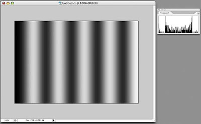
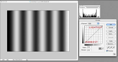
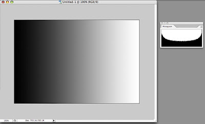 To make this easier to understand, let's start with a simple image of a black-to-white gradient. This image should have pixels representing all 256 levels on the black-to-white scale, and if we look at the histogram for this image, we see that is true. We can see that there is a curve that runs continuously from left to right. The darkest pixels fall to the left of center and the lightest pixels fall to the right.
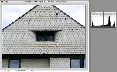
 Let's look at a black and white photo and its histogram. This image also has pixels that range from pure black to pure white, but the curve shows us that overall, there are more darker pixels than light (more of the curve falls to the left of the center line). The curve is no longer smooth because our image is more tonally complex, with uneven numbers of pixels at any given point on the horizontal axis.
 And here's an image with minimal color that shows more of a predominance of light pixels than dark, although, once again the entire range from black to right is represented in the histogram.
Why should you care, you ask? Because you can use the information in the histogram to guide you when making tonal corrections to your images. Even if you don't want a full range of tones in your images (for whatever artistic reason), the histogram can show you exactly where the pixels that make up your image land on the dark-light continuum, and knowledge, as they say, is power.
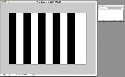 Let's play around a little. Here's another image and its histogram. The histogram looks a bit odd, doesn't it? If you look closely (click on the image to display it larger, then hit your Back button to return) you will see that there is a line at the far left (dark) that goes all the way up (lots of pixels are black), a line at the far right (light) that goes all the way up (lots of pixels are white), and a bunch of little stubby lines spread out along the X axis. These represent what is known as anti-aliasing on a computer, where the boundaries between the black and white bars are not as crisp as they may appear, but have a slight blur to them, resulting in a few gray pixels of various luminance in the image.
 If we actually apply a blur to the image (Filters>Gaussian Blur) and look at the resulting histogram, now we see more of a distribution of pixels along the X axis.
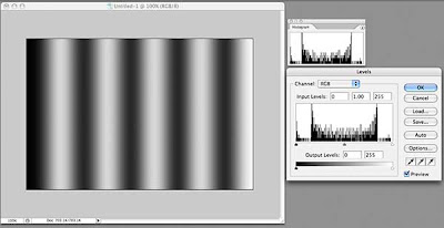 How is this of use? Let's look at one of the more commonly used tools for tonal correction, Levels (Image>Adjustments>Levels, or, preferably, add a Levels Adjustment Layer—Layers>New Adjustment Layer>Levels). What do we see in the Levels dialog box? It's our friend the histogram, looking identical to the one in the Histogram window, but this one has some sliding controls under it. Hmmm...
 By default, these sliders are positioned at the far left, the far right, and right in the middle. If we drag the middle slider to the right, we will shift more of the image's pixels into the dark, as shown in the preview window. Look at the curve in the histogram window—it no longer matches that in the Levels dialog box, but rather shows that we have shifted pixels toward the dark.
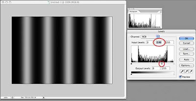
Hold down the Option key (Windows: Alt key) and the "Cancel" button changes to "Reset." Click that and the levels dialog box returns to its default settings. Now drag the middle slider to the left and watch how the image turns lighter as we move more pixels towards white. The histogram window shows this clearly as well.
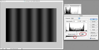 At the bottom of the Levels dialog box, there is a black-to-white bar gradient with two more sliders, one at each end. Click the right slider (white) and drag it to the left. We have just darkened the entire image. Notice that the histogram window shows our curve now squeezed to the left (darker). Move the slider back and try the other one; the image gets lighter.
Generally, when I adjust the tonal range of a photograph, I leave these bottom sliders alone because I want a full tonal range. I do, however, use them when working with drawings or illustrations or where I want a specific, lower-contrast effect.
Lets see how we might use the histogram with another tonal adjustment tool, the Curves adjustment tool. Many people are confused by this tool, but it is much more powerful than Levels for adjusting tonal problems. One reason for this is that you are not limited to sliders on one axis, but can create as complex a curve as you need to get the job done.
Remember that I am using Photoshop CS2. Starting with version CS3, the Curves dialog places a histogram behind the grid, a useful thing indeed. We will have to keep an eye on our histogram window instead.
 The grid in Curves is another representation of the distribution of pixels in your image. By default, it opens with a straight line running from lower left to upper right. This line is defined by two points, one at lower left, the other at upper right. The lower left point in our example represents the darkest pixel in our image. That pixel might not actually be black, but by looking at the histogram window, we can see that our image does contain pixels near or equal to black. The upper right point represents the lightest pixel in our image.
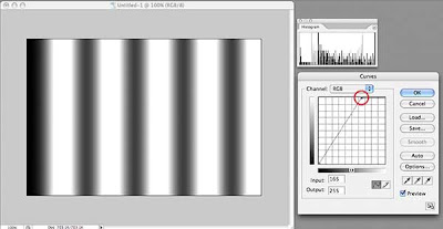 The steeper the line between these two end points, the more "contrasty" the image. If we drag the top point to the left, we are telling Photoshop to convert more light colored pixels toward the lightest value in the image. Conversely, if we drag the bottom point to the right, we are shifting pixels to the darkest value in our image. Watch what happens to the histogram when we do this and you can see the pixels being shifted either left or right.
Now, let's add another point to our line. I've placed this point (just click on the spot where you want a new point) right in the middle, which should represent the pixels exactly half-way between the brightest and the darkest pixels. If our brightest pixel is pure white (R255 G255 B255) and our darkest pixel is pure black (R0 G0 B0), this new point will be close to a 50% gray (R128 B128 G128).
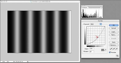 Click this new point and drag it slightly towards the bottom right corner. Without changing the darkest or lightest pixels, we have shifted the pixels in between towards the dark end, as shown in the histogram. If we drag this point up towards the upper left corner, we will shift these pixels toward the light. This is just like dragging the middle slider in the Levels adjustment tool, so why use Curves?
Because we can add as many points to the line as we want!
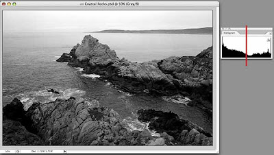
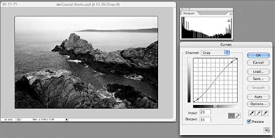
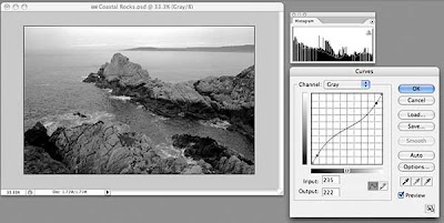 Back to our rocks. This image has pixels at both ends of the luminance scale, as shown by the histogram, so we won't change either of the two original points in Curves. Our histogram shows more pixels tend to dark than light, and the image has fairly high contrast. We can lessen the contrast with a great deal of control by adding two points to our curve near the existing points, drawing the top one down slightly and drawing the bottom one up slightly. This results in a lower contrast image. Our histogram now shows more pixels grouped in the middle.
 To increase the contrast, we add two points in the same positions, but draw the upper one slightly up and the lower one slightly down. The histogram now shows more pixels at the ends of the scale and increased contrast.
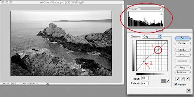 Now, what if I want to lighten just some of the darker areas, while leaving the lighter areas completely untouched? First, place a new point in the upper right quadrant. By leaving the curve straight between this point and the upper right corner, all of the light pixels represented by this section of the curve will remain unchanged. Now, I can add a point halfway between point #1 and the bottom left and drag slightly up. I have just lightened the darker areas of my image without affecting the lightest areas. You can put many, many points on this line and fine-tune your tonal adjustment if you need to. To remove a point, drag it off the grid on any side and it will disappear.
I'll do a more detailed post on the Curves adjustment tool soon, because there are many other useful features that I haven't touched on here.
If you've read this far, congratulations! I hope this little exploration has been useful and that you will start looking at the histograms of your images as you process them in the image manipulation application of your choice. In a future post, I will delve deeper into the histogram window, because, like most things in Photoshop, there's more useful features buried within.
Many image processing applications have them, and they tend to scare the bejeezus out of people. Let's take a look, and perhaps you will find out how useful they are. Personally, I consider them absolutely necessary, but then I've been told I'm weird.
This examination will be done using Photoshop CS2, but you might see histograms in other programs like Apple's Aperture or Adobe's Lightroom. In Photoshop, make sure the Histogram window is showing (Window>Histogram). I usually have it docked in a palette with the Navigator, so for now, I've just grabbed the window by its name and dragged it out of the palette so I can position it right next to my images.
I am going to be working with RGB images, which are comprised of three color channels (Red, Greed, and Blue) representing the three primaries of additive color, in which equal amounts of red, blue, and green light combine to form pure white. This is different from the primary colors a traditional artist is concerned with, which is known as subtractive color, where the three primaries are red, blue, and yellow.
In Photoshop, you can see the separate channels by opening the Channels window (Window>Channels). For an RGB image, you will see four default channels: the combined image (RGB), the Red channel, the Blue channel, and the Green Channel. If you click on the individual channels of an image that you have opened in Photoshop, you can see the differences between the channels.
By default, Photoshop shows these channels as gray-scale images, which might be confusing at first. Also by default, each channel has a "bit depth" of 8, which means that each channel can contain a possible 256 shades of gray, from pure black to pure white. When the three channels are combined, the result is said to have a bit depth of 24, meaning that the image can contain over 16 million distinct colors. Whew!
A histogram is merely a distribution graph of all of the pixels in an image, based on their relative luminance, plotted horizontally from black (left side) to white (right side), with 256 possible positions along the horizonal axis.
 To make this easier to understand, let's start with a simple image of a black-to-white gradient. This image should have pixels representing all 256 levels on the black-to-white scale, and if we look at the histogram for this image, we see that is true. We can see that there is a curve that runs continuously from left to right. The darkest pixels fall to the left of center and the lightest pixels fall to the right.
 Let's look at a black and white photo and its histogram. This image also has pixels that range from pure black to pure white, but the curve shows us that overall, there are more darker pixels than light (more of the curve falls to the left of the center line). The curve is no longer smooth because our image is more tonally complex, with uneven numbers of pixels at any given point on the horizontal axis.
 And here's an image with minimal color that shows more of a predominance of light pixels than dark, although, once again the entire range from black to right is represented in the histogram.
Why should you care, you ask? Because you can use the information in the histogram to guide you when making tonal corrections to your images. Even if you don't want a full range of tones in your images (for whatever artistic reason), the histogram can show you exactly where the pixels that make up your image land on the dark-light continuum, and knowledge, as they say, is power.
 Let's play around a little. Here's another image and its histogram. The histogram looks a bit odd, doesn't it? If you look closely (click on the image to display it larger, then hit your Back button to return) you will see that there is a line at the far left (dark) that goes all the way up (lots of pixels are black), a line at the far right (light) that goes all the way up (lots of pixels are white), and a bunch of little stubby lines spread out along the X axis. These represent what is known as anti-aliasing on a computer, where the boundaries between the black and white bars are not as crisp as they may appear, but have a slight blur to them, resulting in a few gray pixels of various luminance in the image.
 If we actually apply a blur to the image (Filters>Gaussian Blur) and look at the resulting histogram, now we see more of a distribution of pixels along the X axis.
 How is this of use? Let's look at one of the more commonly used tools for tonal correction, Levels (Image>Adjustments>Levels, or, preferably, add a Levels Adjustment Layer—Layers>New Adjustment Layer>Levels). What do we see in the Levels dialog box? It's our friend the histogram, looking identical to the one in the Histogram window, but this one has some sliding controls under it. Hmmm...
 By default, these sliders are positioned at the far left, the far right, and right in the middle. If we drag the middle slider to the right, we will shift more of the image's pixels into the dark, as shown in the preview window. Look at the curve in the histogram window—it no longer matches that in the Levels dialog box, but rather shows that we have shifted pixels toward the dark.
Hold down the Option key (Windows: Alt key) and the "Cancel" button changes to "Reset." Click that and the levels dialog box returns to its default settings. Now drag the middle slider to the left and watch how the image turns lighter as we move more pixels towards white. The histogram window shows this clearly as well.
 At the bottom of the Levels dialog box, there is a black-to-white bar gradient with two more sliders, one at each end. Click the right slider (white) and drag it to the left. We have just darkened the entire image. Notice that the histogram window shows our curve now squeezed to the left (darker). Move the slider back and try the other one; the image gets lighter.
Generally, when I adjust the tonal range of a photograph, I leave these bottom sliders alone because I want a full tonal range. I do, however, use them when working with drawings or illustrations or where I want a specific, lower-contrast effect.
Lets see how we might use the histogram with another tonal adjustment tool, the Curves adjustment tool. Many people are confused by this tool, but it is much more powerful than Levels for adjusting tonal problems. One reason for this is that you are not limited to sliders on one axis, but can create as complex a curve as you need to get the job done.
Remember that I am using Photoshop CS2. Starting with version CS3, the Curves dialog places a histogram behind the grid, a useful thing indeed. We will have to keep an eye on our histogram window instead.
 The grid in Curves is another representation of the distribution of pixels in your image. By default, it opens with a straight line running from lower left to upper right. This line is defined by two points, one at lower left, the other at upper right. The lower left point in our example represents the darkest pixel in our image. That pixel might not actually be black, but by looking at the histogram window, we can see that our image does contain pixels near or equal to black. The upper right point represents the lightest pixel in our image.
 The steeper the line between these two end points, the more "contrasty" the image. If we drag the top point to the left, we are telling Photoshop to convert more light colored pixels toward the lightest value in the image. Conversely, if we drag the bottom point to the right, we are shifting pixels to the darkest value in our image. Watch what happens to the histogram when we do this and you can see the pixels being shifted either left or right.
Now, let's add another point to our line. I've placed this point (just click on the spot where you want a new point) right in the middle, which should represent the pixels exactly half-way between the brightest and the darkest pixels. If our brightest pixel is pure white (R255 G255 B255) and our darkest pixel is pure black (R0 G0 B0), this new point will be close to a 50% gray (R128 B128 G128).
 Click this new point and drag it slightly towards the bottom right corner. Without changing the darkest or lightest pixels, we have shifted the pixels in between towards the dark end, as shown in the histogram. If we drag this point up towards the upper left corner, we will shift these pixels toward the light. This is just like dragging the middle slider in the Levels adjustment tool, so why use Curves?
Because we can add as many points to the line as we want!
 Back to our rocks. This image has pixels at both ends of the luminance scale, as shown by the histogram, so we won't change either of the two original points in Curves. Our histogram shows more pixels tend to dark than light, and the image has fairly high contrast. We can lessen the contrast with a great deal of control by adding two points to our curve near the existing points, drawing the top one down slightly and drawing the bottom one up slightly. This results in a lower contrast image. Our histogram now shows more pixels grouped in the middle.
 To increase the contrast, we add two points in the same positions, but draw the upper one slightly up and the lower one slightly down. The histogram now shows more pixels at the ends of the scale and increased contrast.
 Now, what if I want to lighten just some of the darker areas, while leaving the lighter areas completely untouched? First, place a new point in the upper right quadrant. By leaving the curve straight between this point and the upper right corner, all of the light pixels represented by this section of the curve will remain unchanged. Now, I can add a point halfway between point #1 and the bottom left and drag slightly up. I have just lightened the darker areas of my image without affecting the lightest areas. You can put many, many points on this line and fine-tune your tonal adjustment if you need to. To remove a point, drag it off the grid on any side and it will disappear.
I'll do a more detailed post on the Curves adjustment tool soon, because there are many other useful features that I haven't touched on here.
If you've read this far, congratulations! I hope this little exploration has been useful and that you will start looking at the histograms of your images as you process them in the image manipulation application of your choice. In a future post, I will delve deeper into the histogram window, because, like most things in Photoshop, there's more useful features buried within.
Wednesday, January 7, 2009
Cooking: Rack of Lamb with Moroccan Spices
Our local grocery had a special on these little "half-racks" of lamb, so I grabbed one for dinner this evening. Usually, I just season rack of lamb with salt, pepper and a little thyme, but I felt like something different. Having read a recipe for home-prepared preserved lemons, a staple of Moroccan cooking, in this morning's newspaper, an idea formed. Having a preserved lemon in the refrigerator sealed the deal.


I prepared the roast the way I always do, removing all the silverskin, then tying the roast between the ribs. Removing the silverskin gives your diners a more pleasant experience at the table, as they don't end up with something in their mouth they can't possible chew. Tying the roast results in a lovely plump chop when the roast is carved.

I peeled several cloves of garlic and put them on my cutting board with a healthy pinch of kosher salt, about 1 1/2 teaspoons of cumin seed, and a generous grinding of Mignonette pepper, which is a blend of black pepper, white pepper, and coriander seed. I minced that until it was pretty fine. It smelled heavenly.
Next, I removed and discarded the inside flesh from half a preserved lemon, then rinsed the rind in cold water. I chopped the rind into small dice, then mixed it with the herb/garlic mixture. The smell got even better.
I brushed the roast with a little olive oil, then packed the spice/lemon melange all over the top.

Into a preheated 450° oven on a rack set in the middle of the oven, for about 25 minutes, until an instant-read thermometer inserted into the thickest part read 130°. Out it came to rest, covered with foil, for at least 10 minutes. I actually ended up letting it rest longer, as it took my sweetie longer to get home from work than I had planned for, but I just put it back in the oven (now turned off) for about 5 minutes prior to carving.

I removed the strings, carved, and plated it up. The longer-than-usual resting period resulted in a lovely uniform pink throughout the entire chop.
And the final verdict? Delicious, although I liked it better than my companion, who liked the flavor but didn't like eating the lemon/herb crust so much. I, on the other hand, scraped every last bit of it up and slathered it on each and every forkful. We had the chops with a baked garnet yam and a green salad, which were lovely accompaniments.
I probably won't make this on a regular basis (my sweetie prefers my usual preparation) but might make it again some time if I find myself with an extra preserved lemon.
Monday, January 5, 2009
A Reverence of Convenience, Apparently

One of the best things about living on an island in Puget Sound is the trees that surround us.
Until they fall down and take the power out.
The power went off last night around 9pm, came on this morning just long enough to for us to reset the cable modem, fire up the computers, and reset the clocks. Then it went out again. The house was a brisk 60° and the cats were not happy.
Now, I absolutely love trees. I love to look at them, draw them, paint them. I don't even mind raking leaves all that much. I love the shade they cast in the summer, the shapes they form in the winter, the beautiful dappled light they filter, the homes they provide for birds and squirrels and the occasional raccoon. The thrill of hearing bald eagles cry from their perch high atop the Douglas Fir in the backyard gives me a thrill every single time.
In addition to Douglas Firs, we have Western Red Cedars and Red Alders in our yard. It's hard to love the Alders for many reasons—they seem to be dropping things onto the yard and garden during each season, be it catkins, leaves, branches, their little cones or the copious leaves that refuse to fall all at once, guaranteeing many sessions with the rake.
I don't particularly like pulling the hundreds of seedlings out of the garden beds, from the gutters, even from crevices on my car, but they do pull up easily. The fallen leaves get raked into piles and left to decompose or added to the compost pile. Robins and Varied Thrushes love rooting around in them, looking for unwitting earthworms. We pile the fallen branches up in brush piles, which provides shelter for all sorts of little birds, and perches for the Dark-Eyed Juncos and various Wrens.
Still, it seems that if you look sidewise at an Alder, something breaks off and crashes to the ground. Even a mild wind sends them tilting and crashing into their neighbors. And a little snow followed by wind, which we had last night, sends them toppling into the power lines, plunging whole swathes of the island into darkness and cold. Douglas Firs, notoriously shallow-rooted, also seem prone to falling over in wind, and frequently send large broken branches crashing to the ground.
At 2pm today, the inside temperature in the house was a toasty 52° and I was lying on the couch, one cat under the comforter I had draped over me, the other one lying on my chest, trying his best to smother me. There's nothing quite like having a cat's whiskers thrust unceremoniously up your nostril to rouse you from a nice nap. As I was lying there trying to re-position the cat so I could breath, I found myself railing in my thoughts against the power company, whose recorded message had informed me that our outage was caused by "a tree falling into power lines" and than an "investigator" had been sent to assess the damage. It was the same message all day long, and I wanted suddenly to get an axe or a chainsaw and go find this tree that was the source of all my suffering and deal with it.
As it grew darker and darker, I sighed and set about relighting candles, then prepped some food by lantern light so we could eat supper in our cold house. I got out the butane burner that we keep for just such times and got everything ready to go, then sat down with a flashlight and a book to read—and found myself brooding. I got about two pages read when the lights came back on.
Suddenly, all thoughts of tree murder fled from my mind, and I had to laugh at myself for my "reverence of convenience." I happily set about turning the heat up, reset the cable modem, went from dark room to dark room turning on a few lights, just because I could.
Now I'm left pondering my dependence on all the mod cons, as the British would say, and thinking about things I can do to make the next power outage (and there will be more) more manageable. Something well short of cutting down all the trees seems appropriate.
Sunday, January 4, 2009
Tutorial: Basic Photo Enhancement
I am one of those people who loves Photoshop and have used it since it was first released. Despite my years of experience with the program, however, I make no claims as to being a bona fide expert. Somewhat of a mid-level expert, perhaps, but Photoshop's features and tools are so broad that I think one could make a life's work out of studying the program and still never learn all of its secrets.

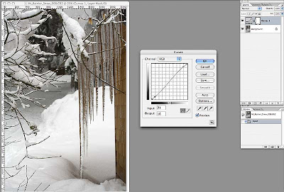 I added two points to the line in the Curves box, one near the top right and one near the bottom left. I dragged the top right point up slightly to increase the brightness of the lighter tones (without affecting the very lightest tones, which are controlled by the point in the top left corner); I then dragged the point I added bottom left down a little to darken the dark tones (again, leaving the darkest tones untouched). This gentle S-curve is a great way to both increase the contrast of your image slightly, while also slightly saturating the color of your photo. If you end up with points that you don't want, just drag them off the grid and they will disappear. If you want to reset the entire thing and start over, just hold down the Option key (Windows: Alt) and the "Cancel" button will change to "Reset." A handy little trick! When you're done adjusting the tonal range of your image, click "OK."
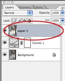 Whichever method you used, you now have a new layer in the Layers Palette that combines the original layer + the Curves Adjustment Layer. Note that we still haven't touched the original image pixels, which are happily sitting on the bottom layer.
 We're going to use one of the more arcane filters that Photoshop has to offer. Most people, when they are playing around with filters, might have dismissed the High Pass filter without realizing what it can do. Not us!
 Now, change the Blend Mode of your top layer to Soft Light. Areas that were 50% gray do not affect the underlying image. Toggle on the layer's visibility by clicking the eye icon for the layer while holding down the Option (Alt) key to see the result, which can be subtle but noticeable.
 Here's my finished photo. It has a better tonal range and is crisper where it counts.
Having said that, I can't imagine my digital life without it. I use it nearly every day, sometimes just to play around, but most often to accomplish some specific task. In the last few years, I have been using Photoshop more and more for what it was originally designed to emulate: the tools a photographer might use to produce good-quality photographs.
This little tutorial outlines some of the basic steps I go through to improve my digital photos. I am using Photoshop CS2 on a Mac, but the techniques are the same for Windows.
First, let's take a look at the image as imported by Photoshop's Camera Raw plug-in. (Click on the image to see it larger.)

In the Camera Raw plug-in, I made sure that none of my whites were blown out (they show up red if they are) and none of the shadows are too dark (they show up blue). I did this by using the Curve feature of the plug-in, but I will write about that in another tutorial. Basically, I wanted the image to have a full range of lights and darks, and will further enhance the tonal balance now that the image is open in Photoshop.
By the way, I shoot all my photos in RAW format as it allows me to control how I correct any problems with the image capture. If you shoot in JPG format, your camera is making those choices for you. Most modern cameras do a good job with this, but I like the control.
I next create a new Curves Adjustment Layer on top of the original layer (Layer>New Adjustment Layer>Curves, or use the drop-down menu at the bottom of the Layers Palette). You do have the Layers Palette open, don't you?
 I added two points to the line in the Curves box, one near the top right and one near the bottom left. I dragged the top right point up slightly to increase the brightness of the lighter tones (without affecting the very lightest tones, which are controlled by the point in the top left corner); I then dragged the point I added bottom left down a little to darken the dark tones (again, leaving the darkest tones untouched). This gentle S-curve is a great way to both increase the contrast of your image slightly, while also slightly saturating the color of your photo. If you end up with points that you don't want, just drag them off the grid and they will disappear. If you want to reset the entire thing and start over, just hold down the Option key (Windows: Alt) and the "Cancel" button will change to "Reset." A handy little trick! When you're done adjusting the tonal range of your image, click "OK."
You can also make this adjustment by just using Image>Adjustments>Curves, but then you actually alter your image's pixels. By using an Adjustment Layer, you leave the original pixels untouched.
Next, I want to copy the accumulative image (the original pixels + the Adjustment Level combined) to a new layer on top of the other layers. As with many things in Photoshop, there are several ways to do this.
The way I use most often, because I love keyboard shortcuts, is to hold down the Shift-Option-Command (Windows: Shift-Alt-Control) keys, then press N, then E. This unlikely key combination copies the image of the combined layers, creates a new layer, then "stamps" the combined image onto the new layer. Pretty nifty, eh?
The second method is to press Command+a (Control+a) to select all, then press Shift-Command+c (Shift-Control+c) to copy the combined image, then press Command+v (Control+v) to paste it into a new layer. You have to use the Shift key in this combination, otherwise you will only copy the Curves Adjustment Layer, not the combined image.
The third method is hidden in the drop down menu under the little triangle at the top of the Layers Palette. Hold down the Option (Alt) key, then click the triangle and select Merge Visible from the drop-down menu. This will create a new layer with the merged contents of all the layers below it. Neat.
 Whichever method you used, you now have a new layer in the Layers Palette that combines the original layer + the Curves Adjustment Layer. Note that we still haven't touched the original image pixels, which are happily sitting on the bottom layer.
I usually do some image sharpening at this point, because I find digital photos usually need a little. The problem is that most sharpening techniques sharpen everything, including any color noise in your image.
If, however, we can manage to just sharpen the edges of elements in our photo, the eye is tricked into thinking it is in sharper focus, without resulting in grainier photos. Again, there are many ways to do this, but I usually start with this one and see how things look.
If you analyze the image, you will usually find that the eye wants areas with more contrast, ie, greater differences in light and dark, to be sharper in order for the mind to "see" the image as a whole as sharper. This is sometimes difficult to visualize, but bear with me.
The quick and dirty method I use is pretty easy. First, load the image's luminance as a selection by pressing Option-Command+~ (Alt-Control+~). Note the resulting "marching ants" on your image. What we have done is to make a selection based on the luminance of the image. Luminance is only concerned with tonal value and ignores color information. Because we are basing our selection on luminance, areas that are more "contrasty" are selected with a harder edge (less feathering) than areas that have less contrast. To see this, just press the Q key to switch into Quick Mask mode and note that the selection itself has a nice range of values (more on Quick Mask mode in a future tutorial). Press Q again to return to our image.
Next, invert the selection by pressing Shift-Command+i (Shift-Control+i). To copy the newly selected pixels to a new layer, press Command+j (Control+j). If you isolate this new top layer, it will look strange (press the eye icon next to the layer while holding down the Option (Alt) key to show only that layer; repeat to turn on all layers) but hold on.
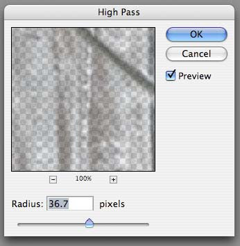
 We're going to use one of the more arcane filters that Photoshop has to offer. Most people, when they are playing around with filters, might have dismissed the High Pass filter without realizing what it can do. Not us!
Go to Filter>Other>High Pass and play with the slider to increase or decrease the effect of the filter. If the Preview button is unchecked, check it to see the effect in real time.
Depending on the original resolution of your image and the sharpness of the original capture, you will need a higher or lower value for the radius. In general, the higher resolution the image (the more pixels), the higher the value, but again, use the preview. You can click and drag in the preview window to see other areas of your image, or change the magnification.
What I look for is emphasized edges. As you drag the slider to the right, you will see the edges bulking up, somewhat like a bad photocopy. Don't worry about the gray tone. When it's where you think it should be, click OK.
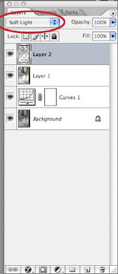
 Now, change the Blend Mode of your top layer to Soft Light. Areas that were 50% gray do not affect the underlying image. Toggle on the layer's visibility by clicking the eye icon for the layer while holding down the Option (Alt) key to see the result, which can be subtle but noticeable.
By the way, you can change the Blend Mode of a layer by another method (of course). Double click to the right of the layer's name (in our case, Layer 2) and a dialog box will open with all sorts of options for that layer. The Blend Mode drop down is near the top of that dialog box.
At this point I sometimes add a second Curves or Levels Adjustment Level on top of everything if I think it's needed.
If you're happy with your result, save your image.
That's it for this one. I'm sure there are a thousand and one other ways to accomplish what I did here, and I will also post a quick tutorial for a second method for sharpening images that has worked well for me.
 Here's my finished photo. It has a better tonal range and is crisper where it counts.
Happy mousing!
Saturday, January 3, 2009
Cooking: Apple Cake

What to do when you have a crisper drawer full of apples of an unknown provenance? The first thing that came to my mind was "Apple Cake."
I wanted a cake that was mostly apples held together by a matrix of cake, so I started consulting my various cookbooks. After striking out with many, I remembered Richard Sax's book Classic Home Desserts and, voilà, there were three recipes.
I chose the one named "Margaret's Apple Cake," although my friend of the same name would undoubtedly shudder at the use of white sugar and unbleached flour. I share life with someone who likes white sugar and flour, so I buy the best quality organic sugar and flour I can find and try to substitute healthier ingredients when I think I can get away with it. This didn't seem like one of those times.
The cake came out great, moist and flavorful, and was even better with some vanilla ice cream.
Cooking: Spicy Almonds

The original recipe appeared in the December 2008 issue of Bon Appétit magazine. As usual with recipes, I tried a couple of things different. Here's my revised recipe:
Spicy Almonds
2 Tblsp peanut or canola oil
3/4 tsp crushed red pepper flakes
1/2 tsp freshly ground black pepper
1/2 tsp ground cumin
1 lb skin-on almonds (about 3+ cups)
Heat the oil in a large, heavy skillet over medium-high heat.
Add crushed red pepper, black pepper, and cumin. Swirl the pan to distribute the spices. Maybe turn on your vent fan, if you have one, because the aroma is pretty intense.
Add the almonds and cook, stirring frequently, until they are aromatic and slightly darker, about 8 minutes. They will sizzle and crack and smell heavenly.
Turn the almonds out onto a rimmed baking sheet and sprinkle with coarse salt. I used kosher salt, but any good sea salt would be great. Kitchen rant: I detest the taste of table salt (you know, the iodized kind) and certainly never use it for a finishing salt. Rant over.
Let them cool, then store in an airtight container so they stay crisp.
These are delicious with your favorite beverage. I think I will try them with a small wedge of stilton cheese and some juicy Fuji apple slices for my lunch on Monday.
So looking forward to that!
Already Tinkering
This baby is hardly an hour old and I've already replaced the header in the template with one of my own design. This will come as no surprise to those who know me…
You might well expect further tweaks to the template as I delve into the HTML, but I think I'll leave things be for the time being.
It's a Beautiful World, After All
I have a problem, which is also somewhat of a blessing.
I am interested in many, many different things (except, notably, cleaning the house). It's always been that way and isn't likely to change now. The thing is, I find the world fascinating. I like to look at things, learn how things work, make things, talk about things, but above all I love the amazing beauty of this world. Hence Che Mondo Bello, which roughly translates as "What a beautiful world." Seems to sum it up nicely.
Anyway, I'll be posting about all sorts of things that interest me, including music, art, photography, cooking, gardening, and whatever else strikes my fancy.
By the way, this blog is inspired by my friend Margaret. The blame, however (if any), is entirely mine!
Subscribe to:
Posts (Atom)

