Many image processing applications have them, and they tend to scare the bejeezus out of people. Let's take a look, and perhaps you will find out how useful they are. Personally, I consider them absolutely necessary, but then I've been told I'm weird.
This examination will be done using Photoshop CS2, but you might see histograms in other programs like Apple's Aperture or Adobe's Lightroom. In Photoshop, make sure the Histogram window is showing (Window>Histogram). I usually have it docked in a palette with the Navigator, so for now, I've just grabbed the window by its name and dragged it out of the palette so I can position it right next to my images.
I am going to be working with RGB images, which are comprised of three color channels (Red, Greed, and Blue) representing the three primaries of additive color, in which equal amounts of red, blue, and green light combine to form pure white. This is different from the primary colors a traditional artist is concerned with, which is known as subtractive color, where the three primaries are red, blue, and yellow.
In Photoshop, you can see the separate channels by opening the Channels window (Window>Channels). For an RGB image, you will see four default channels: the combined image (RGB), the Red channel, the Blue channel, and the Green Channel. If you click on the individual channels of an image that you have opened in Photoshop, you can see the differences between the channels.
By default, Photoshop shows these channels as gray-scale images, which might be confusing at first. Also by default, each channel has a "bit depth" of 8, which means that each channel can contain a possible 256 shades of gray, from pure black to pure white. When the three channels are combined, the result is said to have a bit depth of 24, meaning that the image can contain over 16 million distinct colors. Whew!
A histogram is merely a distribution graph of all of the pixels in an image, based on their relative luminance, plotted horizontally from black (left side) to white (right side), with 256 possible positions along the horizonal axis.
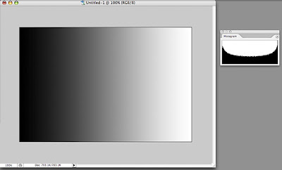 To make this easier to understand, let's start with a simple image of a black-to-white gradient. This image should have pixels representing all 256 levels on the black-to-white scale, and if we look at the histogram for this image, we see that is true. We can see that there is a curve that runs continuously from left to right. The darkest pixels fall to the left of center and the lightest pixels fall to the right.
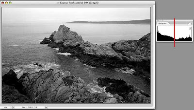 Let's look at a black and white photo and its histogram. This image also has pixels that range from pure black to pure white, but the curve shows us that overall, there are more darker pixels than light (more of the curve falls to the left of the center line). The curve is no longer smooth because our image is more tonally complex, with uneven numbers of pixels at any given point on the horizontal axis.
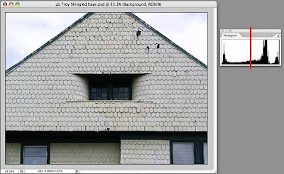 And here's an image with minimal color that shows more of a predominance of light pixels than dark, although, once again the entire range from black to right is represented in the histogram.
Why should you care, you ask? Because you can use the information in the histogram to guide you when making tonal corrections to your images. Even if you don't want a full range of tones in your images (for whatever artistic reason), the histogram can show you exactly where the pixels that make up your image land on the dark-light continuum, and knowledge, as they say, is power.
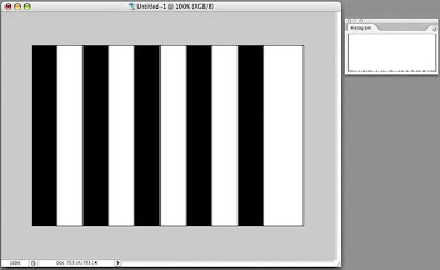 Let's play around a little. Here's another image and its histogram. The histogram looks a bit odd, doesn't it? If you look closely (click on the image to display it larger, then hit your Back button to return) you will see that there is a line at the far left (dark) that goes all the way up (lots of pixels are black), a line at the far right (light) that goes all the way up (lots of pixels are white), and a bunch of little stubby lines spread out along the X axis. These represent what is known as anti-aliasing on a computer, where the boundaries between the black and white bars are not as crisp as they may appear, but have a slight blur to them, resulting in a few gray pixels of various luminance in the image.
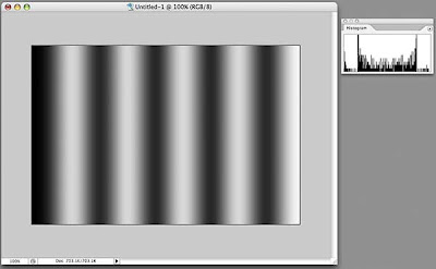 If we actually apply a blur to the image (Filters>Gaussian Blur) and look at the resulting histogram, now we see more of a distribution of pixels along the X axis.
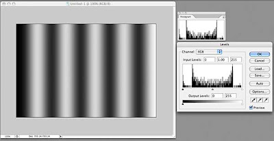 How is this of use? Let's look at one of the more commonly used tools for tonal correction, Levels (Image>Adjustments>Levels, or, preferably, add a Levels Adjustment Layer—Layers>New Adjustment Layer>Levels). What do we see in the Levels dialog box? It's our friend the histogram, looking identical to the one in the Histogram window, but this one has some sliding controls under it. Hmmm...
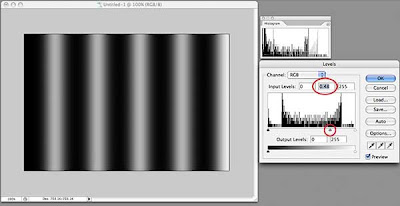 By default, these sliders are positioned at the far left, the far right, and right in the middle. If we drag the middle slider to the right, we will shift more of the image's pixels into the dark, as shown in the preview window. Look at the curve in the histogram window—it no longer matches that in the Levels dialog box, but rather shows that we have shifted pixels toward the dark.
Hold down the Option key (Windows: Alt key) and the "Cancel" button changes to "Reset." Click that and the levels dialog box returns to its default settings. Now drag the middle slider to the left and watch how the image turns lighter as we move more pixels towards white. The histogram window shows this clearly as well.
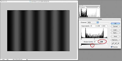 At the bottom of the Levels dialog box, there is a black-to-white bar gradient with two more sliders, one at each end. Click the right slider (white) and drag it to the left. We have just darkened the entire image. Notice that the histogram window shows our curve now squeezed to the left (darker). Move the slider back and try the other one; the image gets lighter.
Generally, when I adjust the tonal range of a photograph, I leave these bottom sliders alone because I want a full tonal range. I do, however, use them when working with drawings or illustrations or where I want a specific, lower-contrast effect.
Lets see how we might use the histogram with another tonal adjustment tool, the Curves adjustment tool. Many people are confused by this tool, but it is much more powerful than Levels for adjusting tonal problems. One reason for this is that you are not limited to sliders on one axis, but can create as complex a curve as you need to get the job done.
Remember that I am using Photoshop CS2. Starting with version CS3, the Curves dialog places a histogram behind the grid, a useful thing indeed. We will have to keep an eye on our histogram window instead.
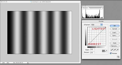 The grid in Curves is another representation of the distribution of pixels in your image. By default, it opens with a straight line running from lower left to upper right. This line is defined by two points, one at lower left, the other at upper right. The lower left point in our example represents the darkest pixel in our image. That pixel might not actually be black, but by looking at the histogram window, we can see that our image does contain pixels near or equal to black. The upper right point represents the lightest pixel in our image.
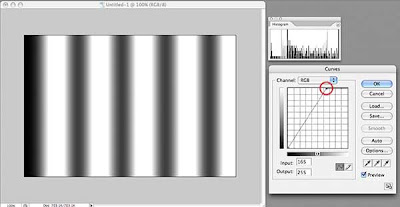 The steeper the line between these two end points, the more "contrasty" the image. If we drag the top point to the left, we are telling Photoshop to convert more light colored pixels toward the lightest value in the image. Conversely, if we drag the bottom point to the right, we are shifting pixels to the darkest value in our image. Watch what happens to the histogram when we do this and you can see the pixels being shifted either left or right.
Now, let's add another point to our line. I've placed this point (just click on the spot where you want a new point) right in the middle, which should represent the pixels exactly half-way between the brightest and the darkest pixels. If our brightest pixel is pure white (R255 G255 B255) and our darkest pixel is pure black (R0 G0 B0), this new point will be close to a 50% gray (R128 B128 G128).
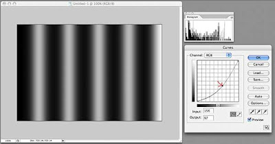 Click this new point and drag it slightly towards the bottom right corner. Without changing the darkest or lightest pixels, we have shifted the pixels in between towards the dark end, as shown in the histogram. If we drag this point up towards the upper left corner, we will shift these pixels toward the light. This is just like dragging the middle slider in the Levels adjustment tool, so why use Curves?
Because we can add as many points to the line as we want!
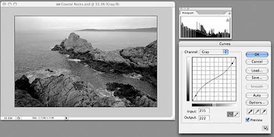 Back to our rocks. This image has pixels at both ends of the luminance scale, as shown by the histogram, so we won't change either of the two original points in Curves. Our histogram shows more pixels tend to dark than light, and the image has fairly high contrast. We can lessen the contrast with a great deal of control by adding two points to our curve near the existing points, drawing the top one down slightly and drawing the bottom one up slightly. This results in a lower contrast image. Our histogram now shows more pixels grouped in the middle.
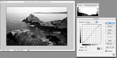 To increase the contrast, we add two points in the same positions, but draw the upper one slightly up and the lower one slightly down. The histogram now shows more pixels at the ends of the scale and increased contrast.
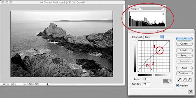 Now, what if I want to lighten just some of the darker areas, while leaving the lighter areas completely untouched? First, place a new point in the upper right quadrant. By leaving the curve straight between this point and the upper right corner, all of the light pixels represented by this section of the curve will remain unchanged. Now, I can add a point halfway between point #1 and the bottom left and drag slightly up. I have just lightened the darker areas of my image without affecting the lightest areas. You can put many, many points on this line and fine-tune your tonal adjustment if you need to. To remove a point, drag it off the grid on any side and it will disappear.
I'll do a more detailed post on the Curves adjustment tool soon, because there are many other useful features that I haven't touched on here.
If you've read this far, congratulations! I hope this little exploration has been useful and that you will start looking at the histograms of your images as you process them in the image manipulation application of your choice. In a future post, I will delve deeper into the histogram window, because, like most things in Photoshop, there's more useful features buried within.


No comments:
Post a Comment