Showing posts with label Photoshop. Show all posts

Monday, September 28, 2009

Tutorial: Circular Photo Frames in Photoshop

Photoshop tutorialThere are several methods for creating a circular frame for a photo in Photoshop. You could, for instance, simply use the oval Marquis tool to make a circular selection of a photo, copy it, and paste it into another document, but that technique only copies the pixels inside the original circular selection. Here's one way to achieve the same thing, while giving you more options for resizing or repositioning the photo behind the frame.

(Click on any image to view a larger version; or, Control-click/right-click and open in another window or tab)

Start with a new document and fill it with whatever background color you wish. I've chosen this reddish orange.
Photoshop tutorialUsing the oval Marquis tool (it's the top left tool in the default Tools palette; click and hold on the tool to select the oval variant of the tool from the drop-down menu), make a circular selection (hold down Shift while dragging to constrain the selection to a perfect circle). With the Marquis tool still selected, you can click inside this selection and move it to wherever you want in the document. To resize the selection, go to Select>Transform Selection and use the corner controls to alter the size; click Return/Enter when done to accept the transformation.
Photoshop tutorialOpen the photo that you want to copy, and select all (Command/Control-A), then copy it (Command/Control-C). You can close the photo file. Go back to the document that has your circular selection in it. If you've left the photo file open, go to Window>new file name to make it the current window.

Now, go to Edit>Paste into and your photo will appear inside the circular selection that you made earlier. When you paste anything into a Photoshop file, Photoshop creates a new layer directly on top of the layer that was active when you initiated the Paste action. When you Paste Into a selection, Photoshop also automatically creates a Layer Mask in the shape of your selection. Of course, your selection can be any shape you want, and Photoshop will create a mask in that shape. Nifty, no?

Photoshop tutorialIf we look at the Layers palette (if it's not already open it, display it now by going to Window>Layers), we can see that our document now has two layers: the Background layer is our original colored layer, and the next layer up contains the photo, as well as the layer mask. The layer mask reveals or hides the contents of the upper layer depending on its shape (and opacity, which we won't be dealing with in this tutorial).

In the Layers palette, we now see a thumbnail for the photo, as well as a black and white thumbnail for the layer mask. Note that the entire photo is actually there, but the layer mask is only showing us the part that is revealed by the white area of the mask. We can now resize the image, or move it around behind the mask, which gives us much more flexibility than if we had simply copied a circular selection of pixels and pasted them in.

Photoshop tutorialIf we want to resize the image, first make sure that the layer that contains it is active (click on the photo thumbnail), then go to Edit>Free Transform (or, just press Command/Control-T). We now see the transformation box on the image, and we can click and drag the controls to resize the image, while leaving the circular mask the same.

Now, let's suppose we want to create a second circular image that's the same size as the first one. To do this, we need to copy the original circular selection that was used to create the original layer mask.
Photoshop tutorial

To do this, Control-click on the layer mask thumbnail in the Layers palette. This loads the mask as a selection. Using the Marquis tool (press M), we can now go back to our image and click inside the circular selection and drag it to a new location. By using the Marquis tool, we are assured of only moving the selection, and not the image inside the selection.
Photoshop tutorial
We can now paste a second image into this new selection (open a new photo, select all, copy, return to the destination image, paste into) and Photoshop will create another new layer, complete with a new layer mask. Easy!

Photoshop tutorialTo add a little dimension to your frames, you can add a Layer Style, which I've done on the left image. To add a Layer Style, click on the image thumbnail of the layer you want to style, then go to Layer>Layer Style and select Inner Shadow (or, click on the Layer Style button at the bottom of the Layers Palette). Adjust the settings to your liking, and press OK.

If you want to move your circular frames around, you need to lock the image and its corresponding layer mask. Do this by click the space between the image thumbnail and the layer mask thumbnail; a small chain link will appear, signifying that they are now locked. You can now use the Move tool (press V) to click and drag the circles around; both the image and the mask will move. When the image and its mask are locked, you can also resize both simultaneously (Command/Control-T). To unlock the image from its mask, just click on the little chain link and you can then transform them independent of one another.

Layer masks are powerful tools, and I've just scratched the surface of what you can do with them. They are an essential tool for compositing images, and well worth your time exploring. Have fun!

Thursday, August 27, 2009

Tutorial: Resizing an Image in Photoshop

If you're posting images online, and who isn't these days, it pays to know how to re-size images so they aren't bandwidth hogs. Photoshop makes this easy, but like all things related to Photoshop, there are a few subtleties that make big differences in the result. In this tutorial, I will re-size a photo, then save it as a JPEG for posting to a blog or website.

Before we get started, I want to say a couple of things about resolution. This subject is little understood outside the computer graphics and print worlds, but it's an important thing to understand.

An image that has a resolution of 300 pixels per inch (ppi), if it is 1 inch by 1 inch in dimensions, will contain 900 pixels. When printed on most printers, it will print at 1 inch by 1 inch. On screen, however, at 100% magnification, it will look much larger. That's because computer monitors (typically) have a resolution of between 72 and 96 pixels per inch. Therefore, our 300 pixel wide image at 300 ppi will appear to be more than 3 times as wide on screen as when it prints.

For print, you usually want the most pixels you can get. This means a large number of pixels both across and down in your image. The more pixels, the better continuous-tone images like photographs will print. But the large number of pixels has a price: the computer has to store data for each and every pixel in your photo, with multiple bits for the three color channels (red, green and blue), as well as information about luminance (the tonal range) and transparency (usually referred to alpha). Image files intended for print are usually quite large (in terms of file size), even if their printed size is small.

We don't need all of that weight for an online image, due to both storage issues (your uploaded photo is just a file on a server somewhere) and bandwidth (how much data needs to be transmitted to a computer to view an online image). Plus, the screen resolution of less than 100 ppi will display much smaller images at what appears to be "normal" size, although if you print that same image, it will be about 1/3 of the size it was on-screen.

Fortunately, the internet is utterly non-committal about the resolution of an image (the ppi). The internet only cares about pixel dimensions—how many pixels wide and how many pixels tall is the image?

So, now that I've diverted into the murky world of image resolution, let's forget about it and concentrate only on the pixel dimensions of our image.

I've opened the photo I'll be working with in Photoshop. I'm using Photoshop CS2 on a Mac, but the techniques are the same for Windows.

Because I shoot all my digital photos at the maximum size allowed by my camera (so I can print nice sharp versions at the largest possible size if I choose), I know that this image is going to be too large to display on-screen. If we go to Image>File Size…, we can examine the resulting dialog box.

Resizing photosThe image's dimensions are shown in the top box, conveniently labeled "Pixel Dimensions," along with the size of the file (in this case, 9MB). I usually have my units of measure set to pixels in Photoshop, so that's what comes up here, but if you don't see "pixels" next to the width and height boxes, use the drop down buttons to change it.

I want people to be able to see the entire photo without scrolling in their browser window, so that gives me a guideline for the height. You can search the web for safe dimensions by browser, but I can't be bothered trying to accommodate the multitude of browsers now available, so I'm going to try 500 pixels for the height. People with small screens are used to scrolling, anyway, so they'll get the experience they're used to.

Before changing the height, make sure the "Constrain Proportions" box is checked. This will ensure that when we change the height, the width will adjust appropriately. We can completely ignore the second section of this dialog box, because we're not concerned with resolution or document size for this exercise, only the pixel dimensions.

Before clicking OK, we need to change one other setting, and that is the bottom control labeled "Resample Image." The default setting for this control, which determines how Photoshop decides which pixels to throw away while maintaining the visual integrity of your image, is Bicubic, and that is fine for a default. I get better results when shrinking an image, however, by selecting "Bicubic Sharper" from the dropdown. Conversely, when enlarging an image (more on this in a minute), I select "Bicubic Softer." I don't understand the technical reasons why this gives me better results, I just like the results I get. Now click OK.

OK, we've re-sized our photo to a web-friendly size. Now, we need it in a format that can be displayed on the web. For photographs, this usually means either JPEG or PNG (an open-source algorithm developed to replace JPEG, which is a patented process). These are both compression algorithms that are used to shrink file size (remember storage and bandwidth). Both are what are known as "lossy" algorithms, meaning they produce a smaller file size by throwing away data. We want to control this process to ensure the highest possible image quality at reasonable file sizes.

If we started with a JPEG (which is the most common format used by point-and-shoot digital cameras), it would be tempting to just hit File>Save now. We could also use File>Save As… and then choosing .jpg or .png in the file type drop-down, but neither of these methods gives us any control at all.

Save for web dialog boxInstead, use File>Save for web…, which will then open some controls we can change. The Save for web… dialog box has several important features. In the upper left, we can select to display only the original image, only the compressed image (Photoshop calls the compressed image "Optimized"), or display them side by side. If you want to try out several different levels of compression, you can click the 4-Up tab, then set different levels of compression for each window. I usually find that the 2-Up configuration works fine. It lets me keep an eye on my original (left pane) as well as the compressed version (right pane). In the lower left corner, you can change the magnification of the previews in case you need to really see what's happening up close. I usually leave it at 100% because that's the size I'll be viewing it once it's online.

In the upper right, there is a dialog box with several controls. Select JPEG or PNG from the drop down (PNG-8 will result in smaller files than PNG-24, but will also throw out more data in order to achieve that small file size). For photos, these are really the only two options you should consider, and I won't discuss the other options in this tutorial.

I've selected JPEG, then played with the Quality setting. The information at the bottom of the right-hand image shows me what the resulting file size will be based on my settings. I usually look for a balance of image integrity and file size, remembering that many users won't often wait for a large image file to download to their screen, but will click away after just a few seconds. When I have the settings the way I want them, I click OK, then give the JPEG a file name.

That's it. My JPEG is now a svelte 40k in size and still looks good. I wouldn't print an image that small, but it's fine for viewing on a screen.

Images of the same pixel dimension can end up different sizes after saving as a JPEG. The "busier" the image, the larger the final file size. This is because the JPEG algorithm looks at the edges between things to determine what it can toss. The more edges (say, in a crowded street shot with lots of buildings, windows, and people), the larger the file size will be. The Save for web… dialog lets you see what your final image will both look like as well as how large it will be (file size), while letting you control both. It's a great tool.

Now, what about enlarging an image? Enlarging the pixel dimensions of an image is problematic to say the least. When you shrink an image, the computer is throwing away pixels; when you enlarge an image, the computer has to invent what it thinks the new pixels should look like. Enlarged images always—repeat, always—suffer a loss of sharpness. It rarely results in a quality image. There are third-party plug-ins and stand-alone programs that purport to do this with greater accuracy, but they are still inventing pixels based on what they start with. I don't recommend enlarging images if the end result is to be crisp and detailed. If your goal is to get something fuzzy or pixelated, and sometimes that's what I need for artistic reasons, then go for it.

So that's it. Have fun!

Sunday, January 11, 2009

Tutorial: Histograms!

I was all set to do a little exploration of some of the ways to make a selection in Photoshop, when a tiny voice popped up in the back of my head that whispered 'What about histograms?" Yeah, I hate when that happens, but the more I thought about it, the larger the idea became, until I found myself prepping sample images and taking screen shots.

Many image processing applications have them, and they tend to scare the bejeezus out of people. Let's take a look, and perhaps you will find out how useful they are. Personally, I consider them absolutely necessary, but then I've been told I'm weird.

This examination will be done using Photoshop CS2, but you might see histograms in other programs like Apple's Aperture or Adobe's Lightroom. In Photoshop, make sure the Histogram window is showing (Window>Histogram). I usually have it docked in a palette with the Navigator, so for now, I've just grabbed the window by its name and dragged it out of the palette so I can position it right next to my images.

I am going to be working with RGB images, which are comprised of three color channels (Red, Greed, and Blue) representing the three primaries of additive color, in which equal amounts of red, blue, and green light combine to form pure white. This is different from the primary colors a traditional artist is concerned with, which is known as subtractive color, where the three primaries are red, blue, and yellow.

In Photoshop, you can see the separate channels by opening the Channels window (Window>Channels). For an RGB image, you will see four default channels: the combined image (RGB), the Red channel, the Blue channel, and the Green Channel. If you click on the individual channels of an image that you have opened in Photoshop, you can see the differences between the channels.

By default, Photoshop shows these channels as gray-scale images, which might be confusing at first. Also by default, each channel has a "bit depth" of 8, which means that each channel can contain a possible 256 shades of gray, from pure black to pure white. When the three channels are combined, the result is said to have a bit depth of 24, meaning that the image can contain over 16 million distinct colors. Whew!

A histogram is merely a distribution graph of all of the pixels in an image, based on their relative luminance, plotted horizontally from black (left side) to white (right side), with 256 possible positions along the horizonal axis.

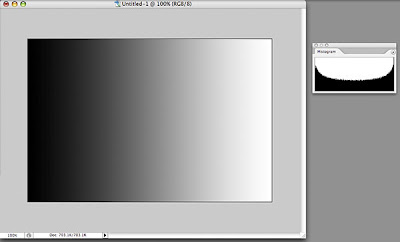
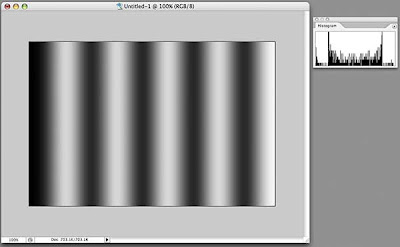
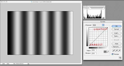
To make this easier to understand, let's start with a simple image of a black-to-white gradient. This image should have pixels representing all 256 levels on the black-to-white scale, and if we look at the histogram for this image, we see that is true. We can see that there is a curve that runs continuously from left to right. The darkest pixels fall to the left of center and the lightest pixels fall to the right.


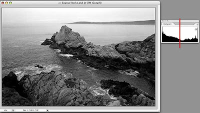
Let's look at a black and white photo and its histogram. This image also has pixels that range from pure black to pure white, but the curve shows us that overall, there are more darker pixels than light (more of the curve falls to the left of the center line). The curve is no longer smooth because our image is more tonally complex, with uneven numbers of pixels at any given point on the horizontal axis.


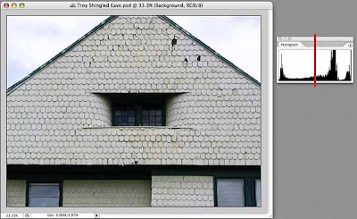
And here's an image with minimal color that shows more of a predominance of light pixels than dark, although, once again the entire range from black to right is represented in the histogram.

Why should you care, you ask? Because you can use the information in the histogram to guide you when making tonal corrections to your images. Even if you don't want a full range of tones in your images (for whatever artistic reason), the histogram can show you exactly where the pixels that make up your image land on the dark-light continuum, and knowledge, as they say, is power.

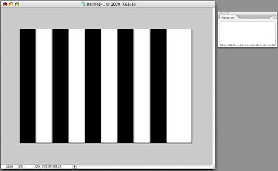
Let's play around a little. Here's another image and its histogram. The histogram looks a bit odd, doesn't it? If you look closely (click on the image to display it larger, then hit your Back button to return) you will see that there is a line at the far left (dark) that goes all the way up (lots of pixels are black), a line at the far right (light) that goes all the way up (lots of pixels are white), and a bunch of little stubby lines spread out along the X axis. These represent what is known as anti-aliasing on a computer, where the boundaries between the black and white bars are not as crisp as they may appear, but have a slight blur to them, resulting in a few gray pixels of various luminance in the image.

If we actually apply a blur to the image (Filters>Gaussian Blur) and look at the resulting histogram, now we see more of a distribution of pixels along the X axis.


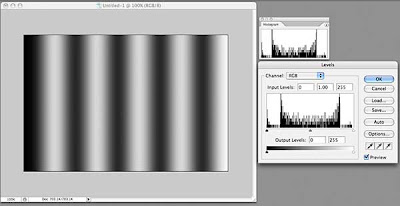
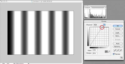
How is this of use? Let's look at one of the more commonly used tools for tonal correction, Levels (Image>Adjustments>Levels, or, preferably, add a Levels Adjustment Layer—Layers>New Adjustment Layer>Levels). What do we see in the Levels dialog box? It's our friend the histogram, looking identical to the one in the Histogram window, but this one has some sliding controls under it. Hmmm...

By default, these sliders are positioned at the far left, the far right, and right in the middle. If we drag the middle slider to the right, we will shift more of the image's pixels into the dark, as shown in the preview window. Look at the curve in the histogram window—it no longer matches that in the Levels dialog box, but rather shows that we have shifted pixels toward the dark.

Hold down the Option key (Windows: Alt key) and the "Cancel" button changes to "Reset." Click that and the levels dialog box returns to its default settings. Now drag the middle slider to the left and watch how the image turns lighter as we move more pixels towards white. The histogram window shows this clearly as well.

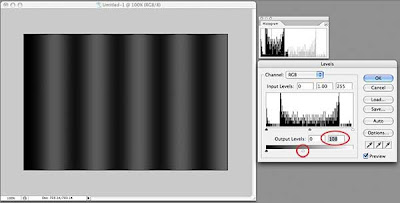
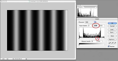
At the bottom of the Levels dialog box, there is a black-to-white bar gradient with two more sliders, one at each end. Click the right slider (white) and drag it to the left. We have just darkened the entire image. Notice that the histogram window shows our curve now squeezed to the left (darker). Move the slider back and try the other one; the image gets lighter.

Generally, when I adjust the tonal range of a photograph, I leave these bottom sliders alone because I want a full tonal range. I do, however, use them when working with drawings or illustrations or where I want a specific, lower-contrast effect.

Lets see how we might use the histogram with another tonal adjustment tool, the Curves adjustment tool. Many people are confused by this tool, but it is much more powerful than Levels for adjusting tonal problems. One reason for this is that you are not limited to sliders on one axis, but can create as complex a curve as you need to get the job done.

Remember that I am using Photoshop CS2. Starting with version CS3, the Curves dialog places a histogram behind the grid, a useful thing indeed. We will have to keep an eye on our histogram window instead.

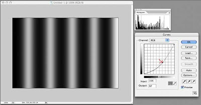
The grid in Curves is another representation of the distribution of pixels in your image. By default, it opens with a straight line running from lower left to upper right. This line is defined by two points, one at lower left, the other at upper right. The lower left point in our example represents the darkest pixel in our image. That pixel might not actually be black, but by looking at the histogram window, we can see that our image does contain pixels near or equal to black. The upper right point represents the lightest pixel in our image.

The steeper the line between these two end points, the more "contrasty" the image. If we drag the top point to the left, we are telling Photoshop to convert more light colored pixels toward the lightest value in the image. Conversely, if we drag the bottom point to the right, we are shifting pixels to the darkest value in our image. Watch what happens to the histogram when we do this and you can see the pixels being shifted either left or right.

Now, let's add another point to our line. I've placed this point (just click on the spot where you want a new point) right in the middle, which should represent the pixels exactly half-way between the brightest and the darkest pixels. If our brightest pixel is pure white (R255 G255 B255) and our darkest pixel is pure black (R0 G0 B0), this new point will be close to a 50% gray (R128 B128 G128).

Click this new point and drag it slightly towards the bottom right corner. Without changing the darkest or lightest pixels, we have shifted the pixels in between towards the dark end, as shown in the histogram. If we drag this point up towards the upper left corner, we will shift these pixels toward the light. This is just like dragging the middle slider in the Levels adjustment tool, so why use Curves?

Because we can add as many points to the line as we want!

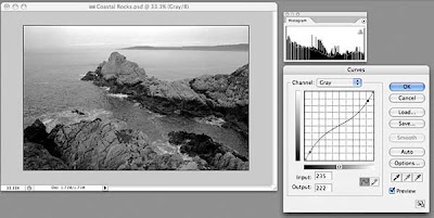
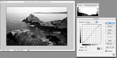
Back to our rocks. This image has pixels at both ends of the luminance scale, as shown by the histogram, so we won't change either of the two original points in Curves. Our histogram shows more pixels tend to dark than light, and the image has fairly high contrast. We can lessen the contrast with a great deal of control by adding two points to our curve near the existing points, drawing the top one down slightly and drawing the bottom one up slightly. This results in a lower contrast image. Our histogram now shows more pixels grouped in the middle.

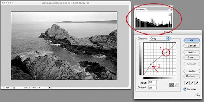
To increase the contrast, we add two points in the same positions, but draw the upper one slightly up and the lower one slightly down. The histogram now shows more pixels at the ends of the scale and increased contrast.


Now, what if I want to lighten just some of the darker areas, while leaving the lighter areas completely untouched? First, place a new point in the upper right quadrant. By leaving the curve straight between this point and the upper right corner, all of the light pixels represented by this section of the curve will remain unchanged. Now, I can add a point halfway between point #1 and the bottom left and drag slightly up. I have just lightened the darker areas of my image without affecting the lightest areas. You can put many, many points on this line and fine-tune your tonal adjustment if you need to. To remove a point, drag it off the grid on any side and it will disappear.

I'll do a more detailed post on the Curves adjustment tool soon, because there are many other useful features that I haven't touched on here.

If you've read this far, congratulations! I hope this little exploration has been useful and that you will start looking at the histograms of your images as you process them in the image manipulation application of your choice. In a future post, I will delve deeper into the histogram window, because, like most things in Photoshop, there's more useful features buried within.

Sunday, January 4, 2009

Tutorial: Basic Photo Enhancement

I am one of those people who loves Photoshop and have used it since it was first released. Despite my years of experience with the program, however, I make no claims as to being a bona fide expert. Somewhat of a mid-level expert, perhaps, but Photoshop's features and tools are so broad that I think one could make a life's work out of studying the program and still never learn all of its secrets.

Having said that, I can't imagine my digital life without it. I use it nearly every day, sometimes just to play around, but most often to accomplish some specific task. In the last few years, I have been using Photoshop more and more for what it was originally designed to emulate: the tools a photographer might use to produce good-quality photographs.

This little tutorial outlines some of the basic steps I go through to improve my digital photos. I am using Photoshop CS2 on a Mac, but the techniques are the same for Windows.

First, let's take a look at the image as imported by Photoshop's Camera Raw plug-in. (Click on the image to see it larger.)

In the Camera Raw plug-in, I made sure that none of my whites were blown out (they show up red if they are) and none of the shadows are too dark (they show up blue). I did this by using the Curve feature of the plug-in, but I will write about that in another tutorial. Basically, I wanted the image to have a full range of lights and darks, and will further enhance the tonal balance now that the image is open in Photoshop.

By the way, I shoot all my photos in RAW format as it allows me to control how I correct any problems with the image capture. If you shoot in JPG format, your camera is making those choices for you. Most modern cameras do a good job with this, but I like the control.

I next create a new Curves Adjustment Layer on top of the original layer (Layer>New Adjustment Layer>Curves, or use the drop-down menu at the bottom of the Layers Palette). You do have the Layers Palette open, don't you?

I added two points to the line in the Curves box, one near the top right and one near the bottom left. I dragged the top right point up slightly to increase the brightness of the lighter tones (without affecting the very lightest tones, which are controlled by the point in the top left corner); I then dragged the point I added bottom left down a little to darken the dark tones (again, leaving the darkest tones untouched). This gentle S-curve is a great way to both increase the contrast of your image slightly, while also slightly saturating the color of your photo. If you end up with points that you don't want, just drag them off the grid and they will disappear. If you want to reset the entire thing and start over, just hold down the Option key (Windows: Alt) and the "Cancel" button will change to "Reset." A handy little trick! When you're done adjusting the tonal range of your image, click "OK."

You can also make this adjustment by just using Image>Adjustments>Curves, but then you actually alter your image's pixels. By using an Adjustment Layer, you leave the original pixels untouched.

Next, I want to copy the accumulative image (the original pixels + the Adjustment Level combined) to a new layer on top of the other layers. As with many things in Photoshop, there are several ways to do this.

The way I use most often, because I love keyboard shortcuts, is to hold down the Shift-Option-Command (Windows: Shift-Alt-Control) keys, then press N, then E. This unlikely key combination copies the image of the combined layers, creates a new layer, then "stamps" the combined image onto the new layer. Pretty nifty, eh?

The second method is to press Command+a (Control+a) to select all, then press Shift-Command+c (Shift-Control+c) to copy the combined image, then press Command+v (Control+v) to paste it into a new layer. You have to use the Shift key in this combination, otherwise you will only copy the Curves Adjustment Layer, not the combined image.

The third method is hidden in the drop down menu under the little triangle at the top of the Layers Palette. Hold down the Option (Alt) key, then click the triangle and select Merge Visible from the drop-down menu. This will create a new layer with the merged contents of all the layers below it. Neat.

Whichever method you used, you now have a new layer in the Layers Palette that combines the original layer + the Curves Adjustment Layer. Note that we still haven't touched the original image pixels, which are happily sitting on the bottom layer.

I usually do some image sharpening at this point, because I find digital photos usually need a little. The problem is that most sharpening techniques sharpen everything, including any color noise in your image.

If, however, we can manage to just sharpen the edges of elements in our photo, the eye is tricked into thinking it is in sharper focus, without resulting in grainier photos. Again, there are many ways to do this, but I usually start with this one and see how things look.

If you analyze the image, you will usually find that the eye wants areas with more contrast, ie, greater differences in light and dark, to be sharper in order for the mind to "see" the image as a whole as sharper. This is sometimes difficult to visualize, but bear with me.

The quick and dirty method I use is pretty easy. First, load the image's luminance as a selection by pressing Option-Command+~ (Alt-Control+~). Note the resulting "marching ants" on your image. What we have done is to make a selection based on the luminance of the image. Luminance is only concerned with tonal value and ignores color information. Because we are basing our selection on luminance, areas that are more "contrasty" are selected with a harder edge (less feathering) than areas that have less contrast. To see this, just press the Q key to switch into Quick Mask mode and note that the selection itself has a nice range of values (more on Quick Mask mode in a future tutorial). Press Q again to return to our image.

Next, invert the selection by pressing Shift-Command+i (Shift-Control+i). To copy the newly selected pixels to a new layer, press Command+j (Control+j). If you isolate this new top layer, it will look strange (press the eye icon next to the layer while holding down the Option (Alt) key to show only that layer; repeat to turn on all layers) but hold on.

We're going to use one of the more arcane filters that Photoshop has to offer. Most people, when they are playing around with filters, might have dismissed the High Pass filter without realizing what it can do. Not us!

Go to Filter>Other>High Pass and play with the slider to increase or decrease the effect of the filter. If the Preview button is unchecked, check it to see the effect in real time.

Depending on the original resolution of your image and the sharpness of the original capture, you will need a higher or lower value for the radius. In general, the higher resolution the image (the more pixels), the higher the value, but again, use the preview. You can click and drag in the preview window to see other areas of your image, or change the magnification.

What I look for is emphasized edges. As you drag the slider to the right, you will see the edges bulking up, somewhat like a bad photocopy. Don't worry about the gray tone. When it's where you think it should be, click OK.

Now, change the Blend Mode of your top layer to Soft Light. Areas that were 50% gray do not affect the underlying image. Toggle on the layer's visibility by clicking the eye icon for the layer while holding down the Option (Alt) key to see the result, which can be subtle but noticeable.

By the way, you can change the Blend Mode of a layer by another method (of course). Double click to the right of the layer's name (in our case, Layer 2) and a dialog box will open with all sorts of options for that layer. The Blend Mode drop down is near the top of that dialog box.

At this point I sometimes add a second Curves or Levels Adjustment Level on top of everything if I think it's needed.

If you're happy with your result, save your image.

That's it for this one. I'm sure there are a thousand and one other ways to accomplish what I did here, and I will also post a quick tutorial for a second method for sharpening images that has worked well for me.


Here's my finished photo. It has a better tonal range and is crisper where it counts.

Happy mousing!